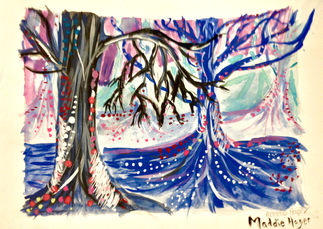
 Spooky Trees Paragraph:
The skills I used and learned in this project was fluid wrist movement and layering as well as mixing colors. The art elements I used was value in the trees to create layers and color to help define the space and forms. Design elements used to create composition are proportion and scale to give dimension to the trees and emphasis in complimenting this otherwise dark piece with pink and white. These elements are used to express a sense of isolation with a surrealistic setting, evoking wonder and solemnity in the viewer of the piece. Even though it's spooky, it gives a distorted sense of comfort. 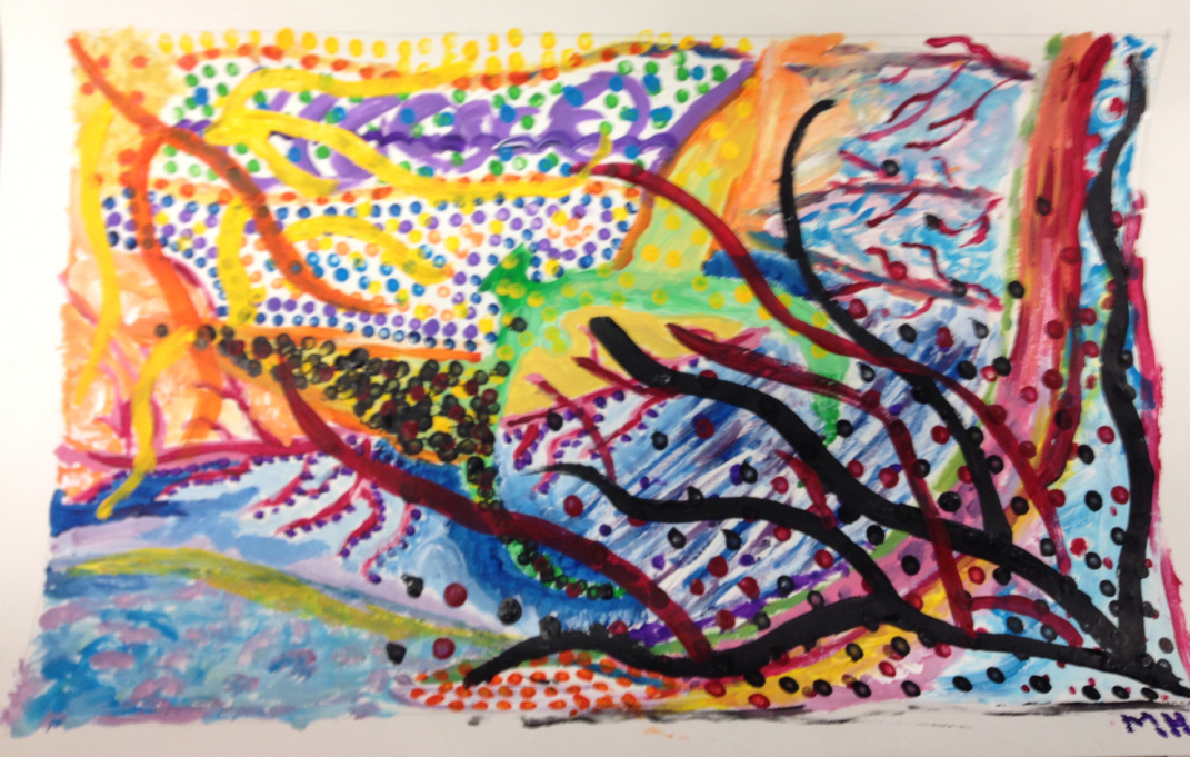 Dream Time Paragraph: This piece was pretty difficult for me, but I feel like I accomplished what I needed to in this piece. Skills I learned and developed were how to make something not figurative while still sending a message to the viewer. The main art elements I used was color to define the edges of forms, and shape to give a sense of direction to the piece. The main design element I used was emphasis, because the bright colors emphasized the piece while the reds and blacks in the corner juxtaposed the other colors, giving an even bigger emphasis on the painting as a whole. Although it's a messy piece, it says a lot about me and reflects a very personal experience, which is most important to me while doing my art. 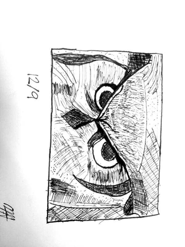 The media I used for this painting was ink. A new skill I learned while doing this piece was how to use as much ink as possible in one swipe, as well as how to create texture rather than an edge. The main art elements used in this piece are texture and line. Texture defines the features of the owl, and line gives the owl more definition. The mood of this piece is serious and somewhat fierce, because the owl has an intense stare going on.
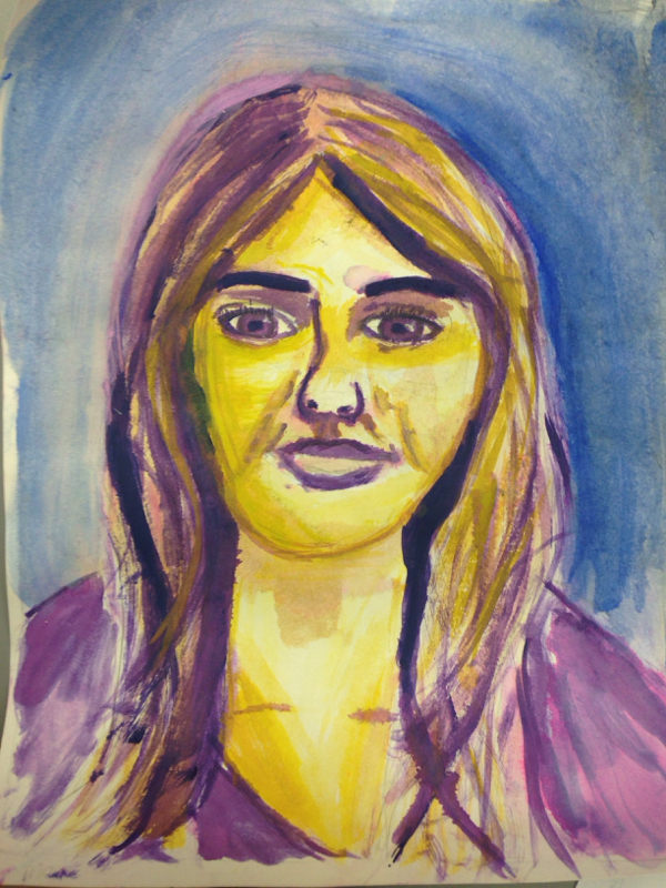 The media I used for this painting was watercolor as well. I feel proud of this painting not because I think I did well, but because it was original in the sense that my features were only painted with the complementary colors of purple and yellow. A new skill I learned while making this piece was the correct proportions of a face, as well as how to layer paint starting with light colors and going to darker colors. The main art elements used were color and space, because the color gave my face definition while space created a realistic illusion of a human face, even when the colors used did not. The mood of this piece was once again, surrealistic because of the color choices, but also somewhat serious due to the look depicted on my face in the portrait.
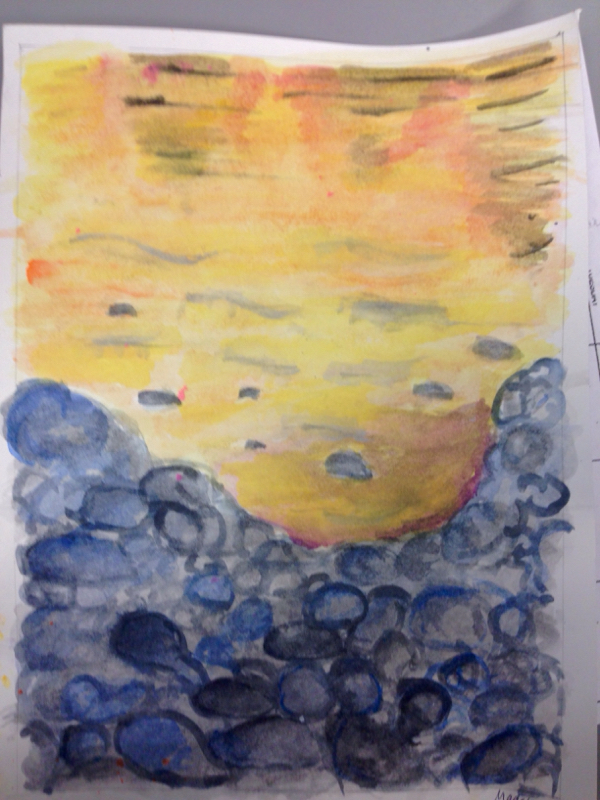
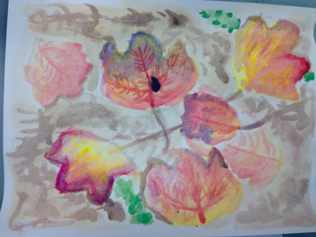 Macro Still Life Paragraph:The media I used in this piece was watercolor. I am not as proud of this piece as I was with my other leaf painting, because I was crunched for time on this one and wasn’t able to successfully re-create the image I wanted to use. A new skill I learned was how to use color to create a dynamic in the leaf: my other leaf painting lacked colors that were vivid. The main art elements used are shape and color: shape gave definition to the leaves, and color set a surrealistic tone for the painting. The mood and tone this painting has is surreal because leaves aren’t shaped that way normally, and the colors aren’t typically as vivid.
 Leaves Paragraph:
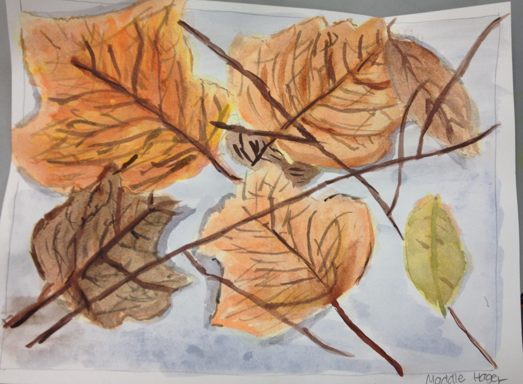
I really enjoyed this project and am particularly proud of it. This image if a layering of leaves, with twigs used as crossections. The media I used was watercolor. One new skill I learned and used in this assignment was how to detail leaves with a fine brush and how to make the smallest line possible. The main art elements I used are color, value and line. Color is used to show different hues of the leaves, value is used to show placement of the leaves and line was used to show the detail in the leaves. This piece, to me shows a mood that is somewhat dreary with slight hope because grays and browns are mainly used, but shades of orange are also used to brighten up the piece. The media I used for this piece is pencil. The main art elements that were used are line, shape and space. Space is used in the concept that when there is nothing drawn in the negative space, you can still see what it's supposed to be. This piece is a drawing of the band and choir hallway, with a downward slant and lockers on the far right. While doing this piece, I learned how shading around the lights is important to give the piece a little bit more perspective. I also learned how to draw the downward slant in the hallway. This piece is rough, because there are all straight lines and no curved lines to soften it up.
In this piece, I drew a room using one-point perspective. I drew lockers on the right side of the room, with a couch on the other side pulled together by a table and chair placed in the middle. There is an art podium located in the back of the room up against the far wall. One new skill I learned was how to draw furniture in perspective. I had a hard time at first, and could not figure out how to do it. After looking up quite a few tutorials, I figured out where to place my parallel and orthogonal lines and was successful with this concept. The media I used for this assignment is pencil, and the main art elements I used were shape, space, line and form. I learned that form in the parallel lines drawing is not the same as form in perspective, because with the room drawing I had to keep orthogonal lines in mind. This piece suggests that I am not too creative, because I decided to draw a room that is essentially the room I'm in instead of creating my own room. I am also a fairly simple person, which you can also tell based off of the limit to complexity the room shows.
|